Benchmark of Python Analytics for Fitness
This blog uses fitness data to benchmark Python analytics against the analytics from leading fitness websites. The fitness data is from a ride in the Great Dublin Cycle - a 100km cycling sportif that took place in Dublin last September. This fitness data was created, and stored in a Garmin activity computer file, by a Garmin bike computer. This data file contains sensor activity data such as time, distance, cadence, heart rate and altitude.
The same activity file was uploaded to the Garmin Connect website and also the Strava website. This allows Python analytics to be benchmarked against the equivalent features from these websites.
This blog finds that Python can analyse fitness data to a similar level of accuracy as the leading web-sites. This opens the possibility to use Python analytics to provide customized and personalized fitness analytics for the performance or serious amateur athlete.
Comparison of Summary Statistics
This section compares the summary statistics generated by three different systems - Python analytics, Garmin Connect and Strava. The following summary statistics are compared:
- distance
- time (elapsed, activity, moving)
- average speed
- max speed
- heart rate (average and maximum)
- cadence (average and maximum)
Python Analytics Summary Statistics
The summary statistics generated by Python analytics are as follows:
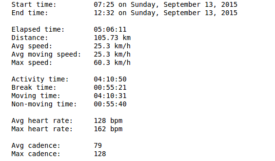
Here are some notes on summary statistics from Python Analytics
- distance agrees with Garmin
- elapsed time agrees with Strava
- activity time agrees (to within one second) with time metric from Garmin
- moving time differs in all three systems: Python number is within a few seconds of Strava
- average speed agrees with Garmin
- max speed differs in all three systems: Python number is in between number reported by Garmin and Strava
- avg heart rate is within one bpm of Starva and Garmin. Max heart rate agrees with Garmin and Strava
- avg cadence is within one rpm of Starva and Garmin. Max cadence agrees with Strava
Garmin Connect Summary Statistics
The summary statistics generated by Garmin Connect are as follows:
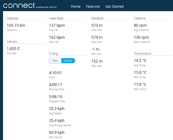
Here are some notes on summary statistics from Garmin Connect
- elapsed time is one second less than elapsed time from Strava and Python - this is possibly a very small calculation error.
- the Garmin time metric agrees (to within one second) with Python activity time metric. Strava does not report this metric.
- the Garmin moving time metric is over a minute lower than either the Strava or Python moving times. This may indicate that the Garmin moving time algorithm sets a higher threshold to classify a data point as moving.
- max speed figure from Garmin is higher than either Python or Strava
- max cadence figure does not agree with either Python or Strava
Strava Summary Statistics
The summary statistics generated by Strava are as follows:
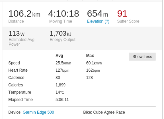
Here are some notes on summary statistics from Strava
- Strava recalculates all distance values from the raw GPS data. It reports a distance metric that is half a kilometer greater than the distance metric reported by Garmin
- elapsed time agrees with Python (and is within one second of Garmin)
- it does not report an activity time metric
- Strava uses moving time metric for its summary metrics. Its moving time is within a few seconds of Python, and over a minute greater than Garmin
- average speed is higher than Garmin and Python
- max speed differs in all three systems: Strava reports the lowest max speed
Data Visualization of Fitness Activity
A number of web-sites provide visualizations of an athlete's activity over distance and time. In this section we review the data visualization from Python Analytics and compare with Garmin and Strava.
Python Analytics Data Visualization
The data visualization from Python are generated using the Python matplotlib visualization package. This package is extensively used by the research community to create plots for scientific papers. The header section of the visualization provides a quick overview of the activity using the main summary statistics. This is followed by visualizations of speed, heart rate, cadence and altitude. Temperature will be added at a future date.

Garmin Connect Data Visualization
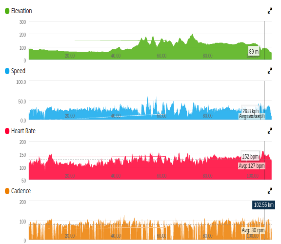
The data visualizations from Garmin Connect show speed, heart rate, cadence, altitude and temperature.
Strava Data Visualization
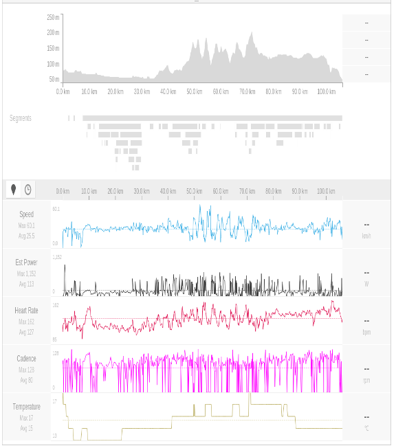
The data visualizations from Strava show speed, heart rate, cadence, altitude, estimated power and temperature.
Conclusions
This blog compares the results from Python analytics with similiar summary statistics and data visualizations from two leading fitness websites. It shows that Python Analytics can produce an accurate and reliable analysis of fitness data.
Python analytics is a powerful platform that is widely used in the financial services industry. Python is the language of choice for many data scientists. The potential of Python analytics is to provide customized and personalized analysis of fitness data that is not currently catered for by the current websites. And as a result provide new insights for the serious amateur and performance athlete.
Last updated this blog on November 25, 2015